I’m a designer, because
it is my passion to create something realistic and scenic. I first wanted to
design things when I had a 3d animation class my junior year of high school. My
3d animation teacher inspired me to push myself to get out of my comfort zone
and create awesome designs I never thought I could make. I especially loved
creating characters, and very colorful beautiful landscapes. I was finally
inspired to want to design as a career after watching the movie “Moon” with Sam
Rockwell. The design of everything especially the moon landscape and space
inspired me to want to design something realistic and emotional as it!
VFX Design Fundamentals
Friday, December 14, 2012
Thursday, December 13, 2012
Research for Project
 |
| This is the design I came up with for my project based off my research. I decided to draw scenic environment that featured two planets balancing out each other with the environment such as the trees. |
Thursday, November 29, 2012
Balance
Balance by Value and Color
Bilateral Symmetry- balance with respect to a vertical axis
 |
| If you imagine the vertical axis going down the middle of the beloved character Wall-E he is the perfect example of bilateral symmetry. |
"Wall-E Poster #2." Imp Awards. N.p., 16 Nov. 2007. Web. 15 Nov. 2012. <http://www.impawards.com/2008/posters/wall_e_ver2.jpg>.
Asymmetrical Balance- is balance achieved with dissimilar objects that have equal visual weight or equal eye attraction.
Scale and Proportion
Proportion- size measured against other elements or against some mental norm or standard
Surrealism- An artistic style that stresses fantastic and subconscious approaches to art making and often results in images that cannot be rationally explained
 |
| The huge giant mushrooms, blue faced caterpillar, clothed rabbit, and human faced roses are some recognizable elements that just cannot be explained in the world of Wonderland. |
"Two New “Alice in Wonderland” Posters and Complete Triptych Poster." Film Sugar.
N.p., 17 Nov. 2009. Web. 29 Nov. 2012.
<http://filmsugar.com/wp-content/uploads/2009/11/alice-in-wonderland-triptych-poster.jpg>.
Exaggerated Scale
| We would know that a helicopter is pretty big but in this picture the scale of the helicopter is smaller due to the huge floating mountains. |
"2009 Academy Awards – Final Predictions." Cinema Fanatic. N.p., 6 Mar. 2010. Web. 16 Nov. 2012. <http://cinemafanatic.files.wordpress.com/2010/03/visualeffects_avatar.jpg>.
Human Scale Reference
 |
| You can see that Optimus Prime is bigger compared to the average human from the Transformers movie poster. |
"The Last Beautiful Transformers Poster - Simply Amazing!!" First Showing.Net. N.p., 14 June 2007. Web. 29 Nov. 2012. <http://www.firstshowing.net/img/transformers-poster-big.jpg>.
Thursday, November 8, 2012
Emphasis and Focal Point
Focal Point- is an emphasized element that can attract attention and encourage the viewer to look close.
Emphasis by Contrast
 |
| The white contrast from the red background makes you focus on Frank Castle aka the Punisher. |
"The Punisher Poster #3." Imp Awards. N.p., 11 Mar. 2004. Web. 8 Nov. 2012. <http://www.impawards.com/2004/posters/punisher_ver3.jpg>.
Emphasis by Isolation
 |
| Leonidas stands over his dead enemies and stands far in front of his men isolating him. |
"300 Poster #11." Imp Awards. N.p., 29 Jan. 2007. Web. 8 Nov. 2012. <http://www.impawards.com/2007/posters/three_hundred_ver11.jpg>.
Emphasis by Placement
 |
| By putting Steve Rogers right in the middle of all the other characters emphasizes that he is the main focus of the movie. |
"NEW Captain America: The First Avenger Poster and a Clip That Takes a Leap of Faith." Scifi Mafia.
N.p., 21 July 2011. Web. 8 Nov. 2012.
<http://scifimafia.com/wp-content/uploads/2011/07/Captain-America-The-First-Avenger-Final-Poster.jpg>.
Unity
Harmony- is pleasing balanced combination of parts that makes up a whole composition
 |
| All the foreshortening knives, and forks thrown at Remy bring harmony to the poster. Also the repeating parallel black tiles on the floor bring balance and harmony to the poster. |
"Ratatouille Poster." Imp Awards. N.p., 8 Nov. 2006. Web. 8 Nov. 2012. <http://www.impawards.com/2007/posters/ratatouille.jpg>.
Proximity- closeness in the placement of elements
 |
| The closer each one of these characters are to each other, the more it brings unity to the poster and makes them look like a group. |
"Watchmen Poster #16." Imp Awards. N.p., 28 Jan. 2009. Web. 8 Nov. 2012. <http://www.impawards.com/2009/posters/watchmen_ver16.jpg>.
Repetition- using the same visual element over again
 |
| The repeating falling meatballs in the poster of Cloudy with a Chance of Meatballs really brings unity to the poster. |
"Cloudy with a Chance of Meatballs Poster." Imp Awards. N.p., 27 Mar. 2009. Web. 8 Nov. 2012. <http://www.impawards.com/2009/posters/cloudy_with_a_chance_of_meatballs.jpg>.
Friday, November 2, 2012
Color
Emotional Color- the emotional response the viewer gets from a color
 |
| The dark red in the picture makes the viewer feel a sense of evil and doom. |
Sithlordpedia. N.p., 10 Apr.
2012. Web. 1 Nov. 2012.
<http://images2.wikia.nocookie.net/__cb20120410142730/starwars/de/images/7/76/Darth-maul-star-wars-the-clone-wars-2.jpg>.
Warm color- a color closer to the yellow-to-red side of the color wheel.
 |
| The yellow-gold color and the red in the poster make for a warm color poster. |
"Another Big, Beautiful Hellboy II Poster." Film School Rejects. N.p., 16 May 2008. Web. 2 Nov. 2012. <http://media.filmschoolrejects.com/images/hellboy2-poster2-sm.jpg>.
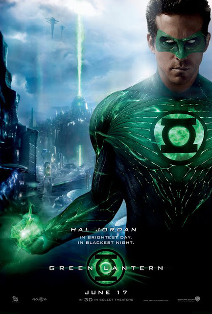
Analogous colors- color scheme that combines several hues located next to each other on the color wheel
 |
| As you can see from the Green Lantern movie poster they use the colors blue and green located right next to each other on the color wheel. |
"WC11: Warner Bros. Unveils New Green Lantern Poster." Spinoff Online.
N.p., 2 Apr. 2011. Web. 2 Nov. 2012.
<http://spinoff.comicbookresources.com/wp-content/uploads/2011/04/green-lantern-poster.jpg>.
Subscribe to:
Comments (Atom)


